O post do FlowingData não é novo, mas vale a pena replicar aqui:

Charts and graphs have found their way into news, presentations, and comics, with users from art to design to statistics. The design principles for these data graphics will vary depending on what you're using it for. Making something for a presentation? You'll want to keep it extremely simple and avoid using a lot of text. Designing a graphic for a newspaper? You'll have to deal with size constraints and try to explain the important parts of your graphic.
However, whatever you're making your charts and graphs for, whether it be for a report, an infographic online, or a piece of data art, there are a few basic rules that you should follow.
There's wiggle room with all of them, and you should think of what follows as more of a framework than a hard set of rules, but this is a good place to start for those just getting into data graphics.
Check the data

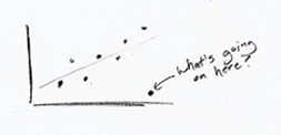
This should be obvious. Data forms the foundation of charts and graphs. If your data is weak, your graph is weak, so make sure it makes sense. Start with some simple graphs to see if there are any outliers or weird spikes. Verify anything that doesn't make sense. You might be surprised how many data entry typos you find in the spreadsheets people send you.
Explain encodings

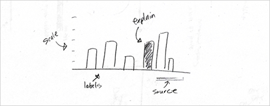
Maybe you use a color scale to indicate magnitude or the size of a square to represent values. Maybe it's a combination of both. Explain what these encodings are supposed to indicate, and don't assume the reader knows what everything means. Most likely he doesn't.
You can provide explanations in a variety of ways, but the most common are providing a legend, directly labeling shapes, or describing your graphic in a lead-in paragraph.
Without your pointers, it's a guessing game for the reader.
Label axes

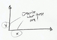
Oh look, what fine gridlines you have there. Without labels or any explanation, they're just decoration. Label your axes so that readers know what scale points are plotted on. Is it logarithmic, incremental, exponential, or per 100 flushing toilets? Without axis labels, I always assume it's that last one. Also, in most cases, you'll want your value axis to start at zero.
Include units

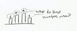
Include some units while you're at it. If you just leave it with naked numbers, it could mean anything from a percentage, to a volume, to the number of chickens that crossed the road. Again, you want to eliminate the need for any guesswork from the reader.
Keep your geometry in check

If your geometry is wrong, this will be the first thing people call you on, especially if you use bubble size to indicate a numeric value, so you better get it right. You'll also probably have the pleasure of seeing your work highlighted negatively on some nerdy blog.
Here's how it works. Size circles and other two-dimensional shapes by area, unless it's a bar graph or something like that. When you size circles by diameter, you end up with circles that are way out of proportion, and that's a bad thing.
Include your sources

This should go without saying. Always include where the data is from. You can put it directly in a graphic, or if it's part of an article, the source can be specified in the copy. This does a couple of things. First, it makes your graphic more reputable, and second, those who are interested can dig deeper or fact check.
Consider your audience

Finally, like I said already, take into account who and what your graphs and charts are for, and design accordingly. You might design a graphic to be super-detailed for a poster that people can stare at for hours. But if it's for a presentation, you should keep the words to a minimum.
You should probably also avoid Comic Sans, but that's your call.
In the end, all of these rules can be broken for specific cases, and you'll learn where you can bend with practice. By no means are these rules absolute.
To put it simply: tell your story clearly and communicate the data accurately. Do that, and you'll be alright.


Nenhum comentário:
Postar um comentário